Overview
Workday is one of the most powerful enterprise platforms on the market—but “powerful” doesn’t always mean usable. Employees and HR teams were getting lost in a jungle of widgets, tabs, and outdated interfaces.
Goals
Redesign the dashboard to feel modern, intuitive, and helpful—without sacrificing the complexity Workday is known for.
Figma
Created detailed wire frames in Figma
Designed graphics in Figma
Problem
The original Workday dashboard is cluttered, overwhelming, and lacks a clear starting point. Users struggle to find basic actions like submitting PTO or checking pay. Important alerts are buried, and the interface fells outdated and impersonal.
The interface didn’t just slow people down—it created frustration, confusion, and a lack of confidence in the system. Tasks that should take seconds often took minutes. Users weren’t just struggling with usability—they were disengaged from a tool meant to support their work life. This wasn’t just a UX problem—it was an employee experience problem, impacting everything from productivity to morale.
Research
I began by researching online to see how other HR platforms structure their dashboards, focusing on tools like SAP SuccessFactors, Oracle HCM, BambooHR, and ADP. I also explored design trends from modern SaaS products like Notion and Slack to understand how they create clarity through layout and hierarchy. This mix of online research, competitor analysis, and product data shaped the foundation of the redesign.
Inspiration
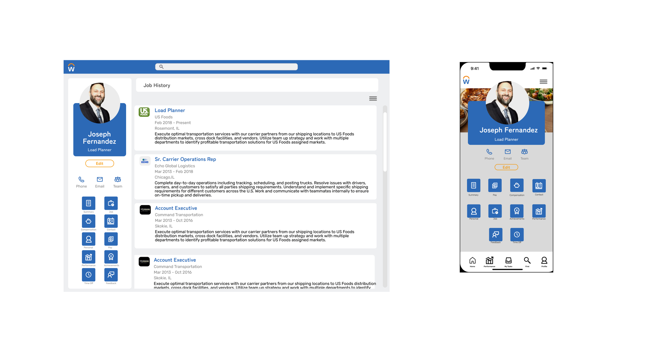
I wanted the redesign to feel more modern, approachable, and less corporate. A card-style layout helped structure content clearly, making it easier to scan and interact with while giving each section room to breathe. I was also inspired to incorporate more visuals—using imagery, icons, and graphic cues to bring personality and context to the experience. With thoughtful use of color, negative space, and hierarchy, the goal was to create a dashboard that felt not just functional, but human, visual, and inviting.
Concept
I focused on making top actions like pay, time off, and team management immediately accessible with clear, visually distinct cards that reduced guesswork. I revamped the visual design to be clean and modern, using clear hierarchy, ample whitespace, and accessible colors and typography to support all users, including those with disabilities. By keeping trusted features, refining frustrating ones, and removing unnecessary clutter, I created a lighter, more intentional dashboard that truly fits how people work.
